 Exciting news today.
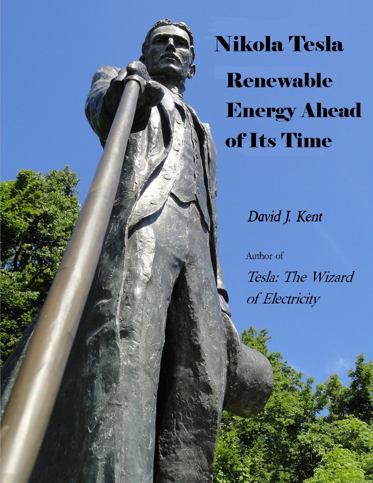
I received the current working cover design for Tesla: Wizard of Electricity.
So, what do you think?
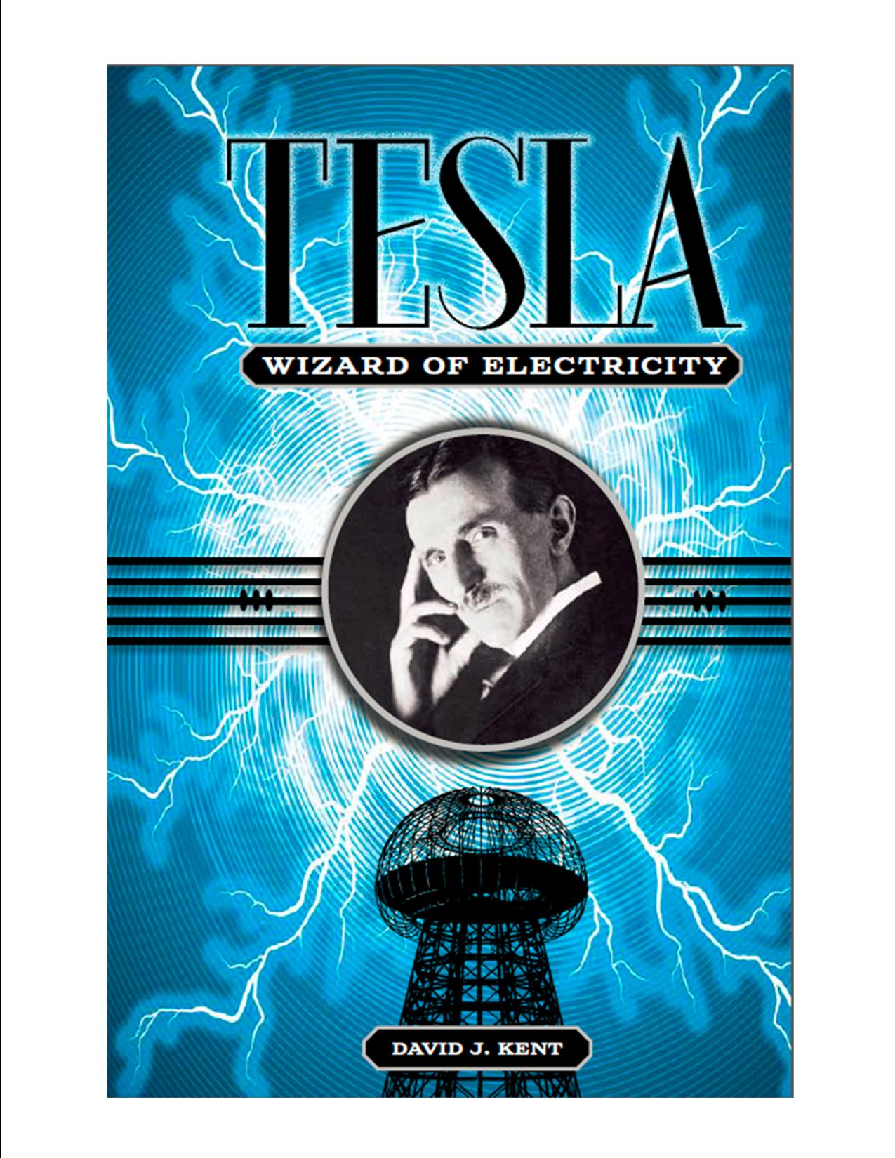
You’ll notice that it differs from the cover design I had posted here up until now. I’ve been using a “body double” while the editor and his staff worked their way through the book layout and design stages. We may still tweak this a bit, but odds are the final cover will look like this one. This past week I also provided two bios – a short one for the back cover and a longer one for the inside. The finish line is within sight.
I have to admit that this is an exciting day for me. I submitted the manuscript to Sterling Publishing last September and have been holding my breath waiting to feel the actual book in my hand. Of course, I’ll have to wait a bit longer since it is just now going to the printer. A bit behind the original schedule but I’m still looking at it “going live” by my birthday.
In the meantime I’ve had the pleasure of meeting many of the people who have worked the hardest to give Nikola Tesla the recognition he deserves. I presented at the Tesla Memorial Conference in New York City in January and hope to present at the Philadelphia Tesla Conference in July. I’ve started lining up other speaking engagements as well, including inquiries for talks at the public libraries in Ipswich, Hamilton-Wenham and Fairfax once the book hits the shelves. Please send me a note if you can arrange a speaking engagement near you (especially if you live in Belgrade, Serbia).
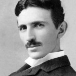
Also feel free to opine on the cover in the comments. Too blue? Not enough lightning bolts? My name not big enough? The photo of Nikola Tesla looks just a wee bit like your Uncle Wally? Let me know what you think.
More on Tesla: Wizard of Electricity.
Follow me by subscribing by email on the home page. And feel free to “Like” my Facebook author’s page and connect on LinkedIn. Share with your friends using the buttons below.



Looks great! Very exciting indeed – congratulations 🙂
Thanks, Heather. Exciting indeed.
Congratulations~~ I like the cover design.. definitely enough lightning bolts! Your name could have been bigger. 🙂 Can’t wait to see the book!
Yeah, I thought my name should be bigger too. 🙂 Some day my name will be the big print since everyone will want to buy my books no matter what the title.
I agree your name should be bigger, though you can use that as a negotiating tool when you contract for future books. 🙂 Really love the intense blue and lighting bolts but let me throw this (cost prohibitive but very cool idea) out there. A lenticular cover with solid blue one view/lighting bolts other view and (because, why not) since there would be 2 views of the medallion in the middle with the Tesla portrait it could flash from his picture to yours (or if you want to be really modest, it could be 2 views of him). Granted, this idea is more or less in jest, but I did pick up a young adult book (series) with lenticular covers and they are really cool looking and would really look good with lightning bolts.
I like how you think! 🙂
Especially the flashing lightning bolts. Doubt they will do it, but I like it. I need to get back to them ASAP with any thoughts so they can get it to the printers. Then we’re ready to start the book signings! Okay, not until the books actually arrive, but my pen is ready.
Very cool! I’m in the “bigger name” camp!
My name will definitely be bigger for the next book. 🙂
I think it looks great. Not sure about uncle Wally though! Lol.
Uncle Wally might need to be replaced. 🙂
The cover really describes the name of the book – wizard, electricity, wardenclyffe, waves .. essential synonyms for the theme. It looks very impressive! I must agree about the size of writer’s name, it has to be bigger definitely. Maybe I would add more contrast to emphasize lightning but before you let the mass printing make a few test prints with RGB and CMYK just to see the difference because sometimes blue on the screen becomes a variant of purple on the paper. The same goes for brightness and contrast.
Thanks for the great ideas, Aleksandar. This is a working design so still time to tweak it. And definitely increase the author’s name (hint, hint to Sterling Publishing). 🙂
Pingback: Tesla: Wizard of Electricity – release date | Science Traveler